Value statement
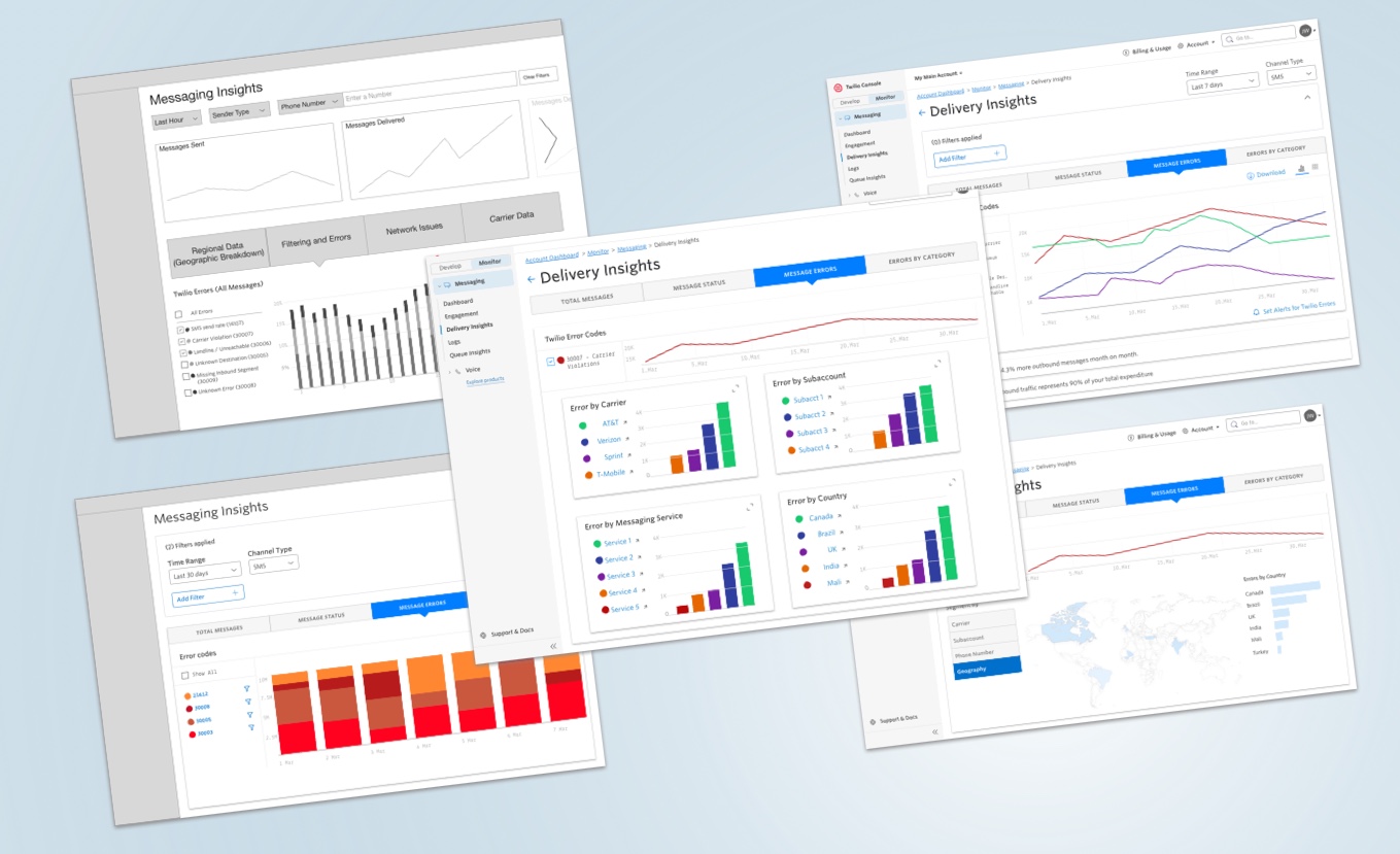
Messaging Delivery Insights helps Twilio customers monitor their messaging traffic and delivery rates, and provides insights into undelivered messages and other issues.
Customer problem statement:
Elena, a dev ops specialist at a major retailer and manufacturer, is using Twilio Messaging to send shipment and delivery notifications to her customers, and needs to know in real time when messages fail, so that she can promptly re-send messages. But in the Twilio console, there is no alerting system, nor any diagnostic tooling that allows her to see delivery failures and other errors in an aggregated way.
Elena winds up spending dev-hours on building internal diagnostic tooling, and additionally, she allocates some of her budget to tools such as Looker and Datadog in order to collate and visualize the vast Message delivery data coming from Twilio.
Team & Project:
As the sole Product Designer in a still nascent design organization, I had the opportunity to wear many hats: researcher, prototyper, user testing facilitator, copywriter, interaction designer, and more.
This project ran about seven months, from concept to public Beta. I worked with a Product Manager and a team of six developers.
Initial research and customer conversations
We scanned thousands of support tickets and began to notice a pattern. We identified and interviewed more than a dozen customers in early 2019 and encountered these patterns:
- Customers were spending considerable sums in developing internal data analysis tooling, and / or paying for data platforms such as Looker and Datadog in order to monitor message delivery rates.
- Customers struggled to understand cryptic error codes, and did not have needed context to identify patterns related to delivery issues, and would place calls to Twilio to uncover the problematic assets
- Customers were not able to receive timely and proactive information when key parameters were trending in the wrong direction.
- Customers do not receive meaningful, actionable guidance about what to do once they have identified delivery issues.
Measuring success
Quantitative:
Usage analytics in Heap: 10% of cohort returns 3x per week.
ⓘ Why this figure?
When we examined our data logs, we learned that the most active API call clusters to our data happened between Mondays and Thursdays. This overlapped with customer interview data that suggested that customers were reviewing error occurrences 3-5 times per week
Qualitative:
Customer Interviews – Are we contributing to customers’ success?
Early exploration & User validation
Approach:
After some whiteboarding and sketching, with the product manager, we discovered we were converging on our initial ideas for the approach. From those concepts, I created several wireframes and strung together a simple prototype to gather early feedback on our direction.
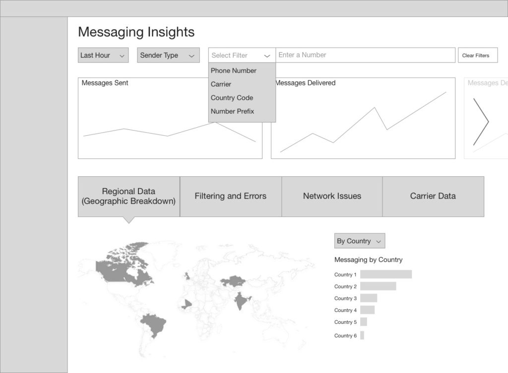
I tried to capture the most frequently mentioned filters and give affordances for those.
What if customers could toggle through different slices of their Message delivery data for at-a-glance information?
Customers reported a number of problematic assets, such as this number, or that carrier. We speculated that these data tools could help them identify those troublesome assets.
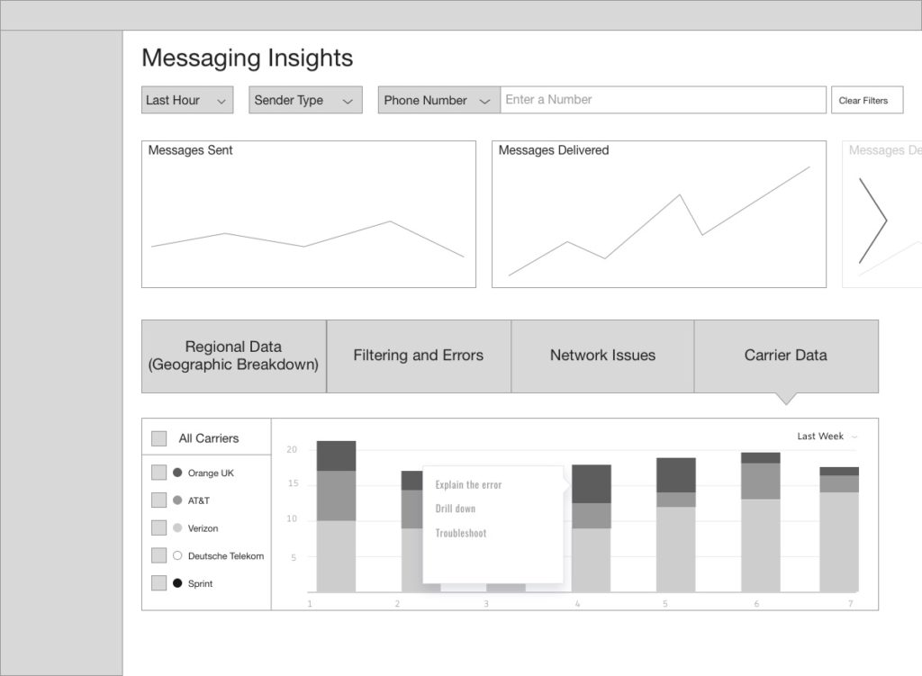
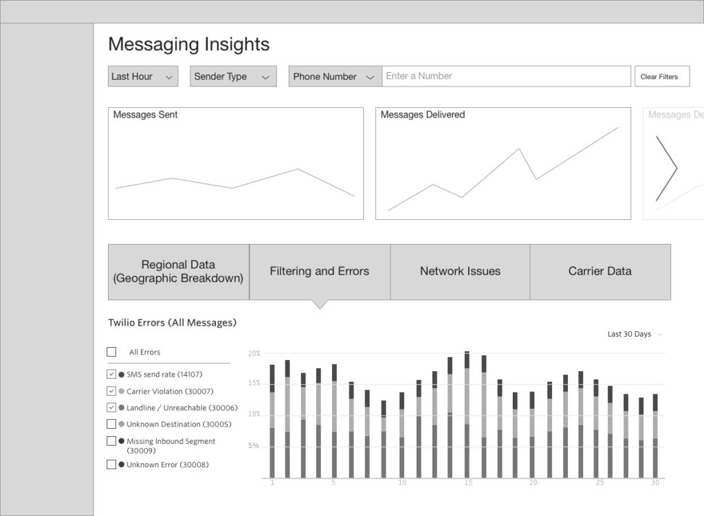
Would customers find value in seeing their Messaging data sliced this way? Would they be able to use the controls to narrow down and identify trends?
Would customers find a funnel approach useful? The concept here was The journey of a message
Spoiler alert: This concept was rejected by customers across the board. It works for email, one customer observed, but SMS is much more complex.
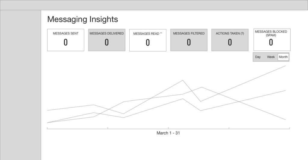
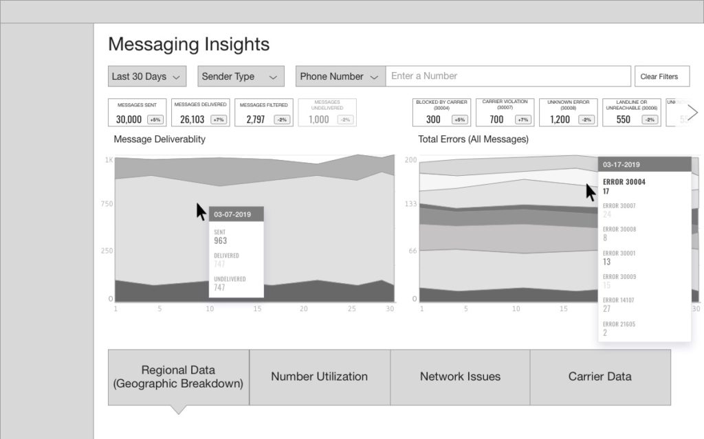
Customers found the “Dashboard” concept immediately overwhelming and stress-inducing.
“I don’t know where I’m supposed to look.”
—Jed, TextRecruit
Customer feedback:
We interviewed customers from TextRecruit, Iterable, Expedia, Nike and more and conducted simple usability studies, asking key questions aimed at uncovering their mental models—the specific tasks they would expect to be able to complete.
This feedback led to some new discoveries, and some new hypotheses:
- Customers needed a way for to set alerts that would trigger when key conditions (trends, error counts) were met.
- My first explorations did provide users the ability to easily narrow sets of data down to increasing levels of detail.
- My early designs were not affording users the ability to customize our vast data sets in ways that made sense to them.
Next Iterations
Folding in all our learnings, I built out simpler, more articulated prototypes to validate the learnings we had identified thus far.
Filtering explorations


Customers liked the flexibility of these, but became overwhelmed.

Customers found this approach to be a bit rigid.
More successful filtering explorations
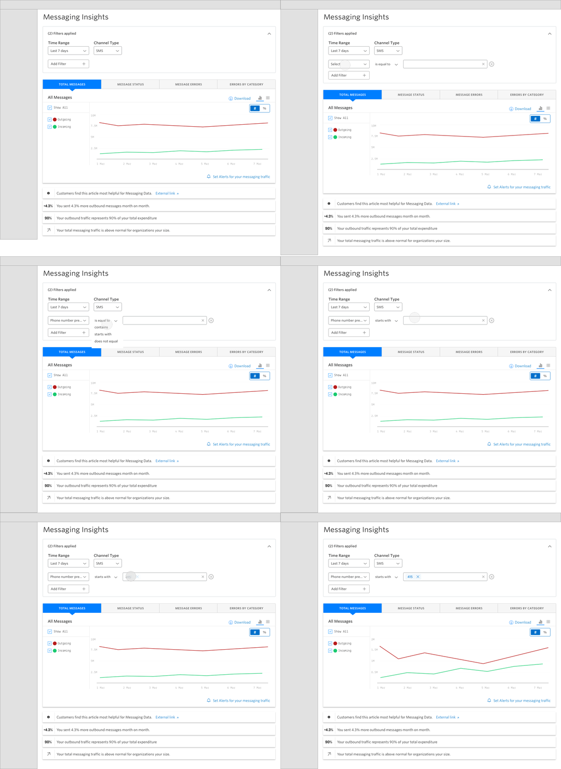
This seems familiar. It’s straightforward and… I know what to do here. Yeah, this part makes sense. I like that I can close it, get it out of the way.
—Developer, Dwelo
Alerting explorations:

Plot interactions:
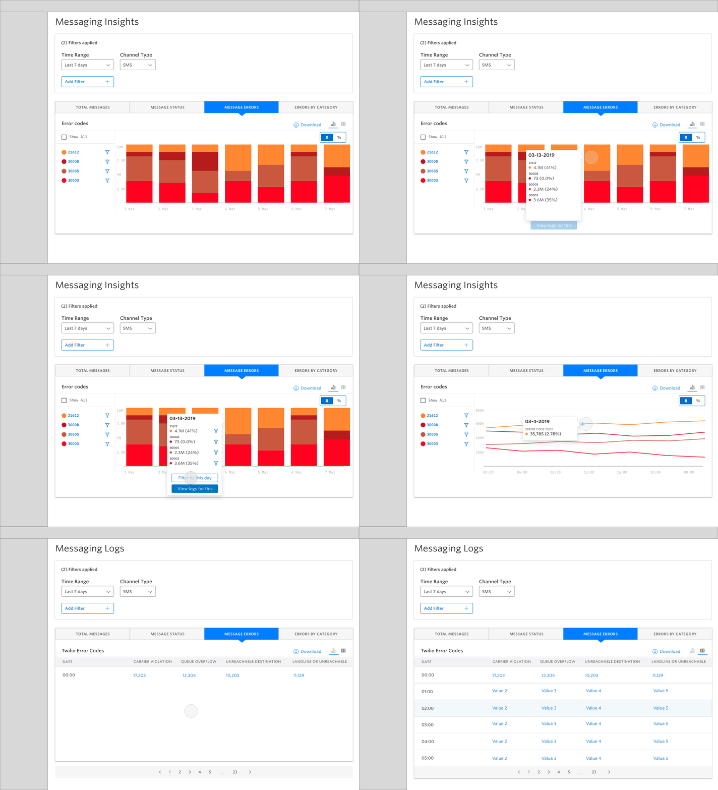
Implementation, compromise, release
Constrained by limited developer resources, it was necessary to identify the most important features and capabilities that could lead us to a Minimum Loveable Product.
![]()
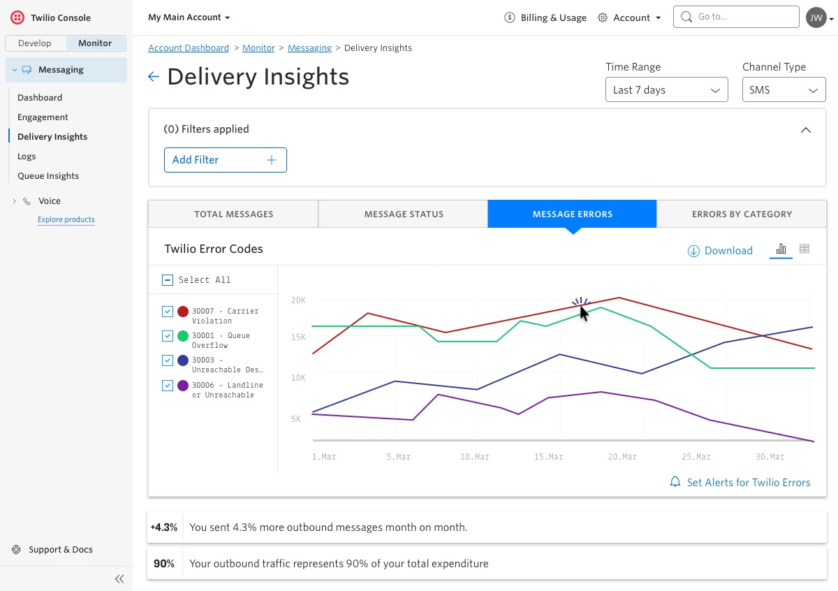
User clicks the red plot – the 30007 line.
Summary
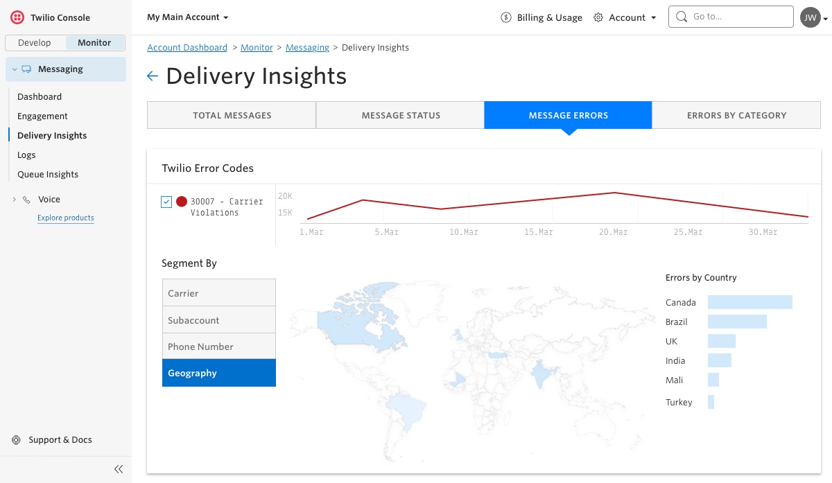
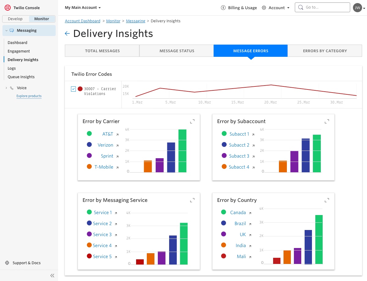
By displaying high-level data across multiple segments, we not only saved precious developer-hours, we also solved the initial customer problem we had encountered:
Customers wanted a way to gauge the health of their Messaging business at a glance, before drilling down.
Accessibility Concerns
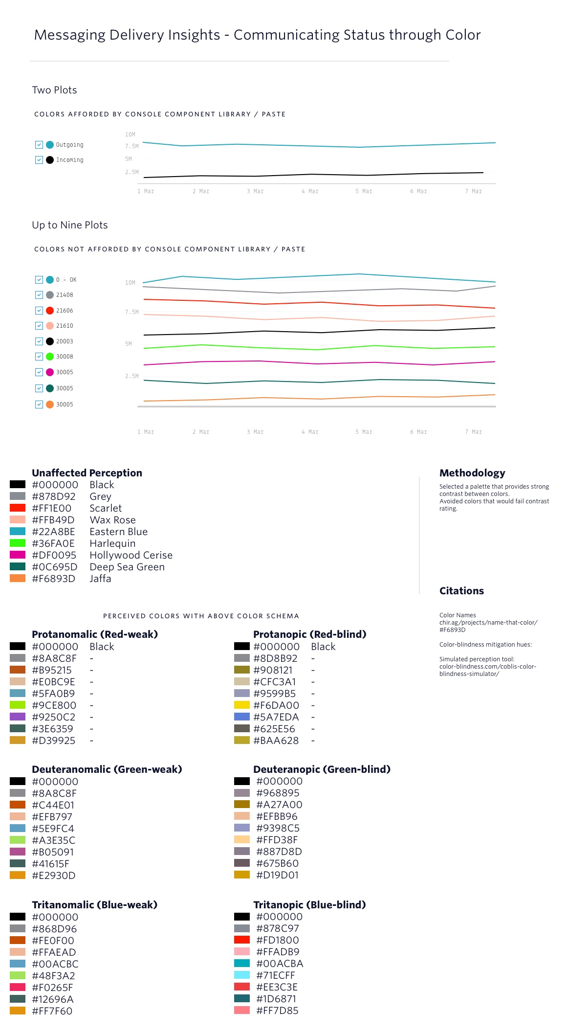
During late-stage customer testing, with Shai—a developer on Nike’s marketing platform team—he revealed to us that he was forced to use Chrome developer tools to inspect our interface in order to parse the different charts; his color-insensitivity made it impossible for him to discern between data plots!
I first conducted a study on the color schema afforded by our design system (internally called Paste).
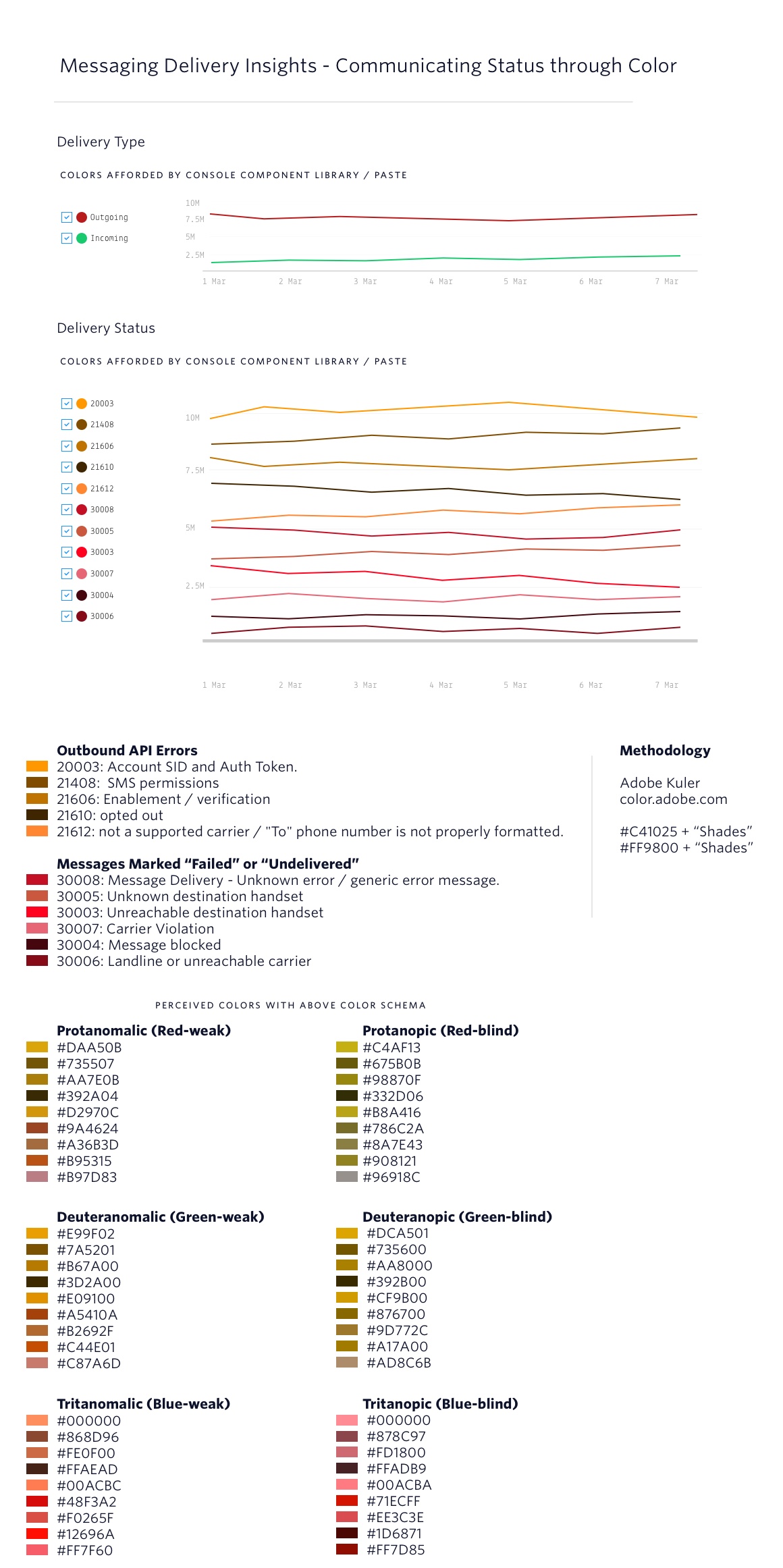
I then conducted an in-depth exploration of options for color utilization that would allow customers with varying levels of color-insensitivity and color-blindness to make better sense of the data in our Insights tool.
Measuring success, and next steps…
While our devs implemented the above changes, the product manager began increasing the number of people we invited to the Beta.
✔By the end of 2019, we had more than 2,000 people using the product.
✔ We also saw return visits to our Insights tool reach 3x per week.
By placing these data tools in the hands of our customers, we are hoping to see more of them—especially new customers—in a position to avoid investing resources in developing their own analytic and diagnostic tooling solutions. Only time will tell our success in this.
Positive-sentiment customer feedback…
Next steps…
Our next area of exploration will include something we call Engagement Insights, an area we hope will be even more of value by affording customers the ability to manage Opt-ins and Opt-outs, track URL clicks, and measure overall success of campaigns across SMS, Facebook Messenger, WhatsApp and more.
Additionally, what we have built thus far will inform the plans of other teams such as the Voice, and Video Conferencing teams.

