Value statement
An improved Twilio Messaging console experience helps customers discover and use powerful functionality for specific use cases and campaigns.
Customers conserve valuable resources not having to build out essential functionality that already exists on the Twilio platform.
Customer problem statement:
Laura, a dev-ops engineer at an enterprise organization, uses Twilio to send a variety of messages to her customers. When Laura perceives that she needs to achieve greater scalability, engagement, compliance and other factors, as her organization grows, she requires additional logic and functionality to expand Twilio’s API capability.
Currently, Laura has to invest developer resources in building out logic that will allow her to scale and optimize her Messaging business, because she either did not discover or did not understand Twilio’s Messaging Services, which provide the precise capabilities she needs, at no extra cost to her.
Team & Project:
I was the sole Product Designer for this project. I worked with a UX researcher to identify our customers, and to build out a Research and Testing Plan. As the sole designer, my work encompassed: information architecture, interaction design, visual design, user testing, copywriting, and more.
This project ran about four months, from concept to working code. I worked with two Product Managers and a team of six developers. Additionally, a UX Researcher worked with us to develop a research and testing plan, and to develop an effective test script.
Initial data and research
By 2020, only 9% of all Messaging customers were using Messaging Services. However, those that were using Messaging Services were sending 1.3x more messages, netting 30-40% more quarterly revenue, and churning from Twilio at lower rates (4-5%, measured by API activity). Was this a discovery problem?
Customer research:
→ We interviewed three customers who we knew were using Messaging Services. How did they begin using them? Did they understand what their purpose and value were?
The redesign process
Existing product heuristic evaluation
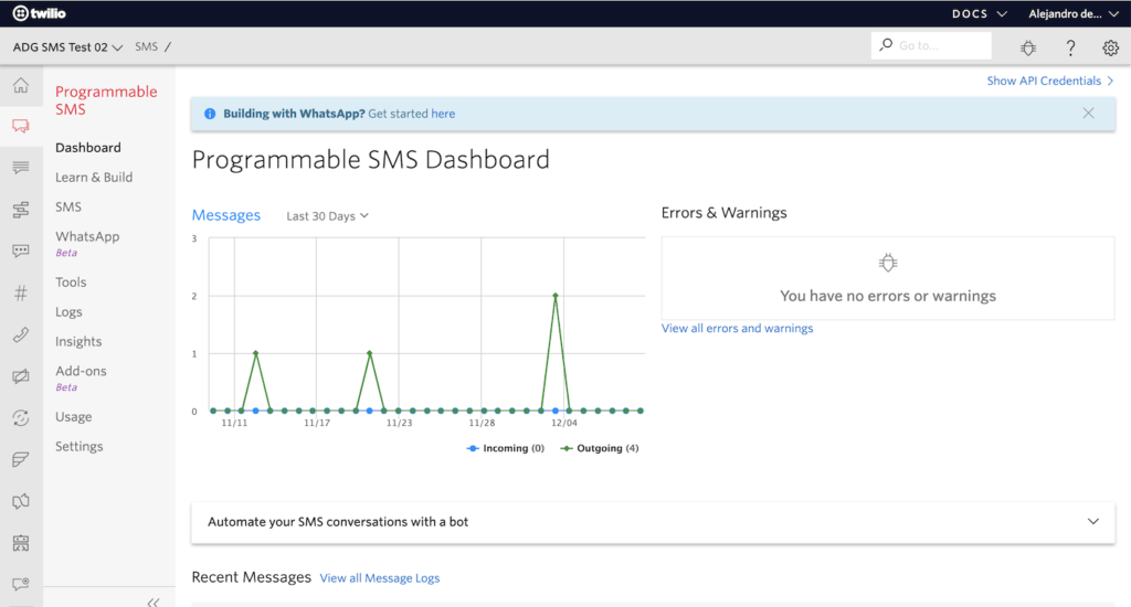
Overwhelming navigation area: customers struggle to find features. Nothing suggests advanced functionality of Messaging Services.

Learn & Build shows nothing about Messaging Services
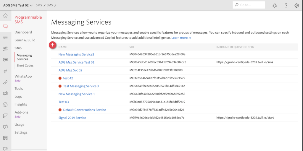
Only in SMS does the customer encounter Messaging Services. But the Messaging Services API is not a child of the SMS API. On the contrary, the Messaging Services API actually spans the SMS API and the WhatsApp API, as well as other channels, which aren’t even listed in the navigation…
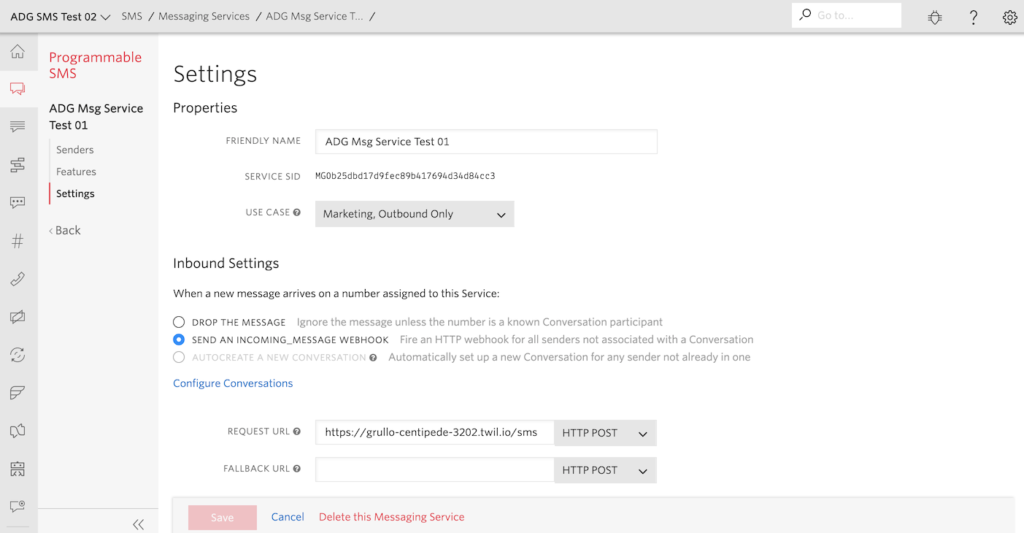
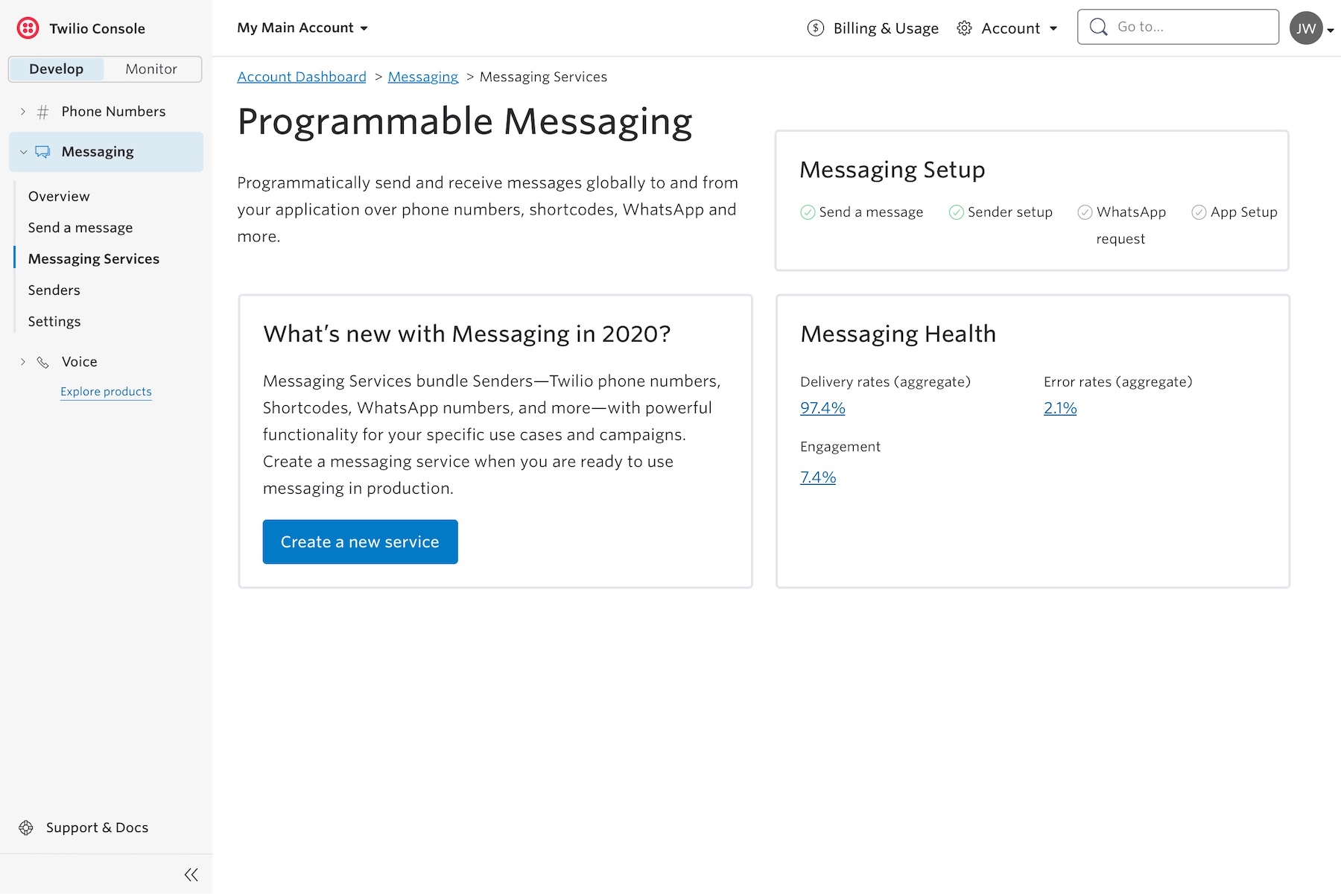
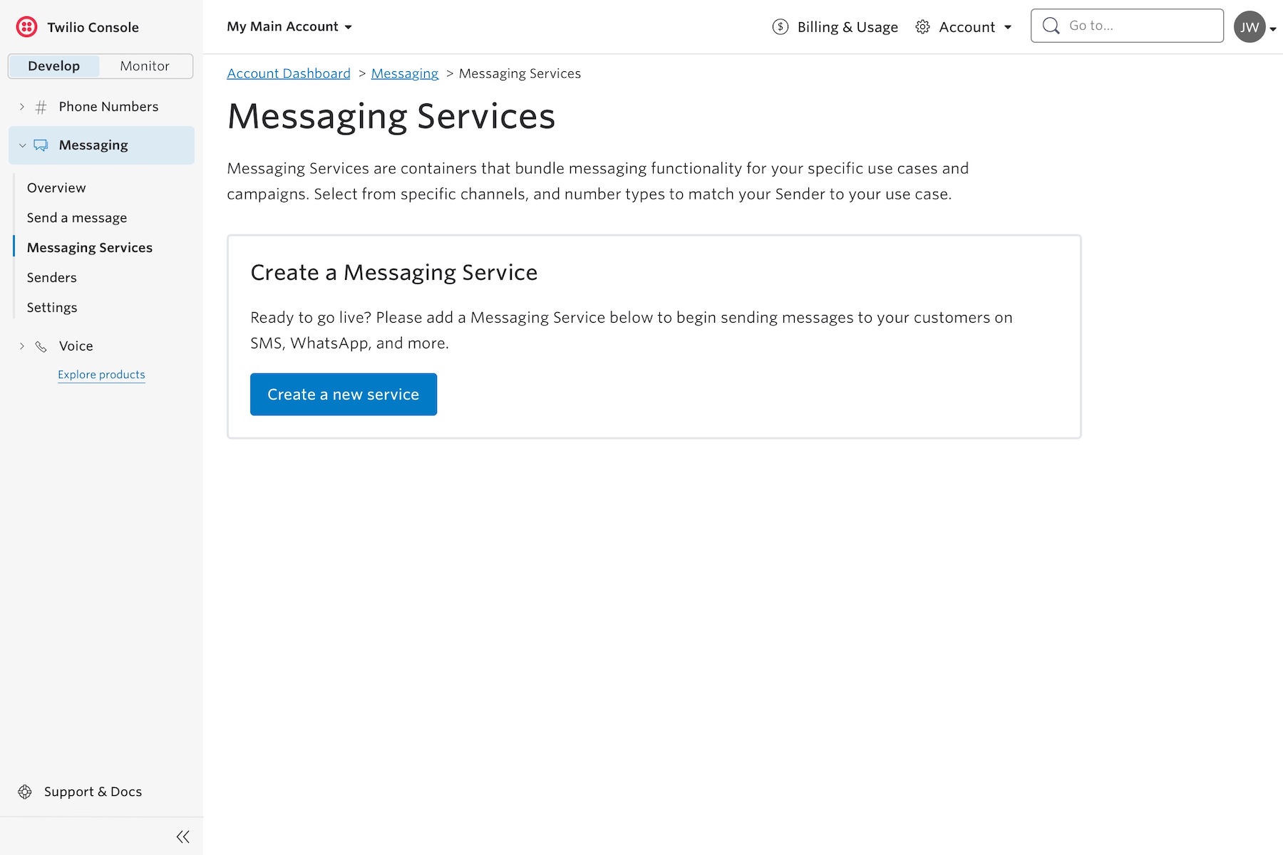
Messaging Services default landing page is incorrect starting place; Messaging Services are powered by phone numbers and other Senders.
There is also no directionality; sys-admin users filed tickets saying they didn’t know how to add phone numbers using the console.
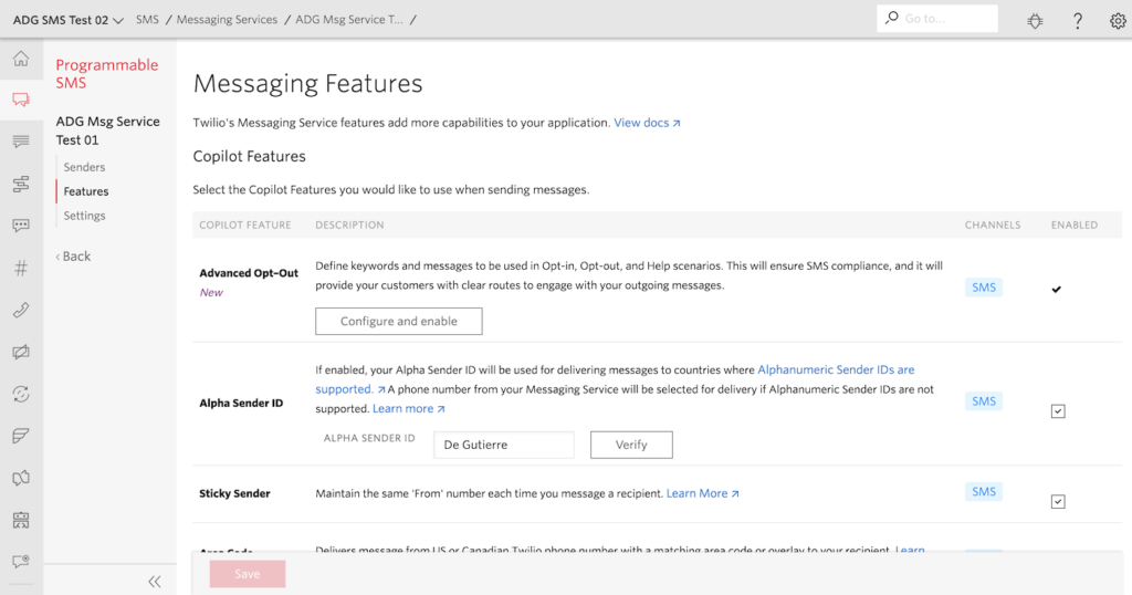
Features list is inconsistent – most are features; some are settings; one is a sender-task. Some things require alphanumeric input. Some can be turned off, and others can’t.
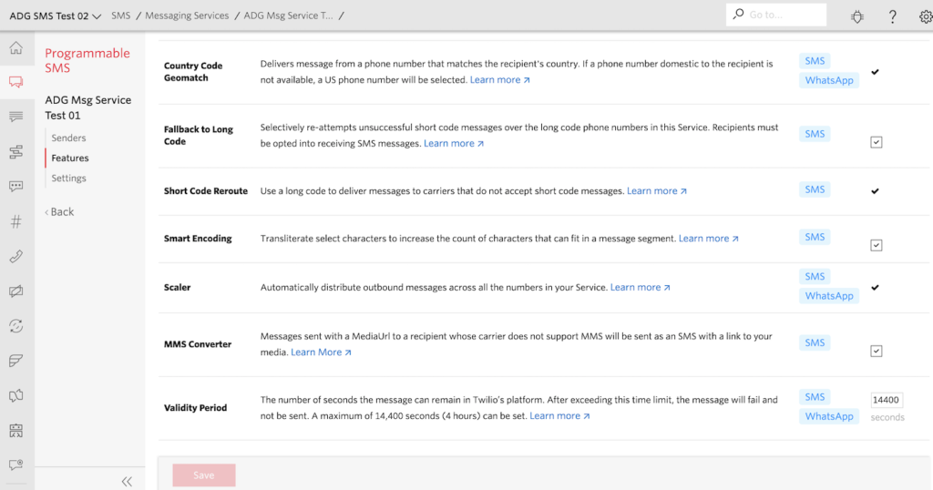
In user testing, customers either failed or took 30+ seconds to locate specific features in this list.
Navigation and information architecture
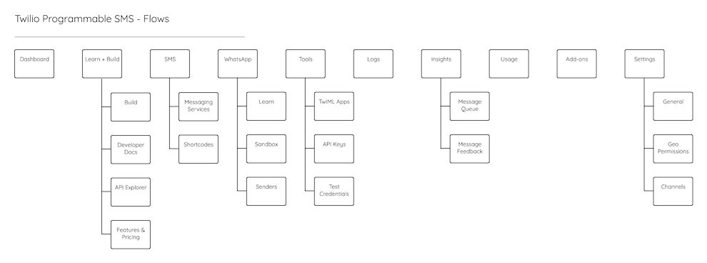
Existing IA was confusing at best. At the top level of the navigation were several “orphan” pages that didn’t belong in the stack, and some parts of the API were presented differently in the interface than they had been built at the API level.
Card sort exercises
We ran a card sorting exercise on Mural to gauge customers’ mental models.
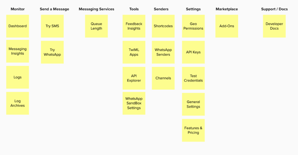
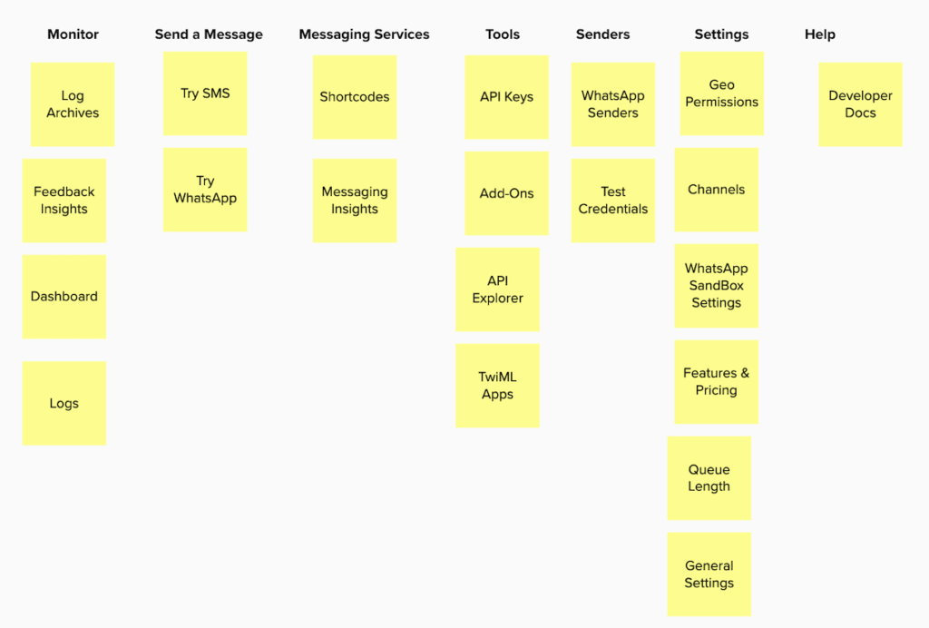
These were two of more than a dozen tests we ran to identify areas of convergence.
Outcomes & learnings
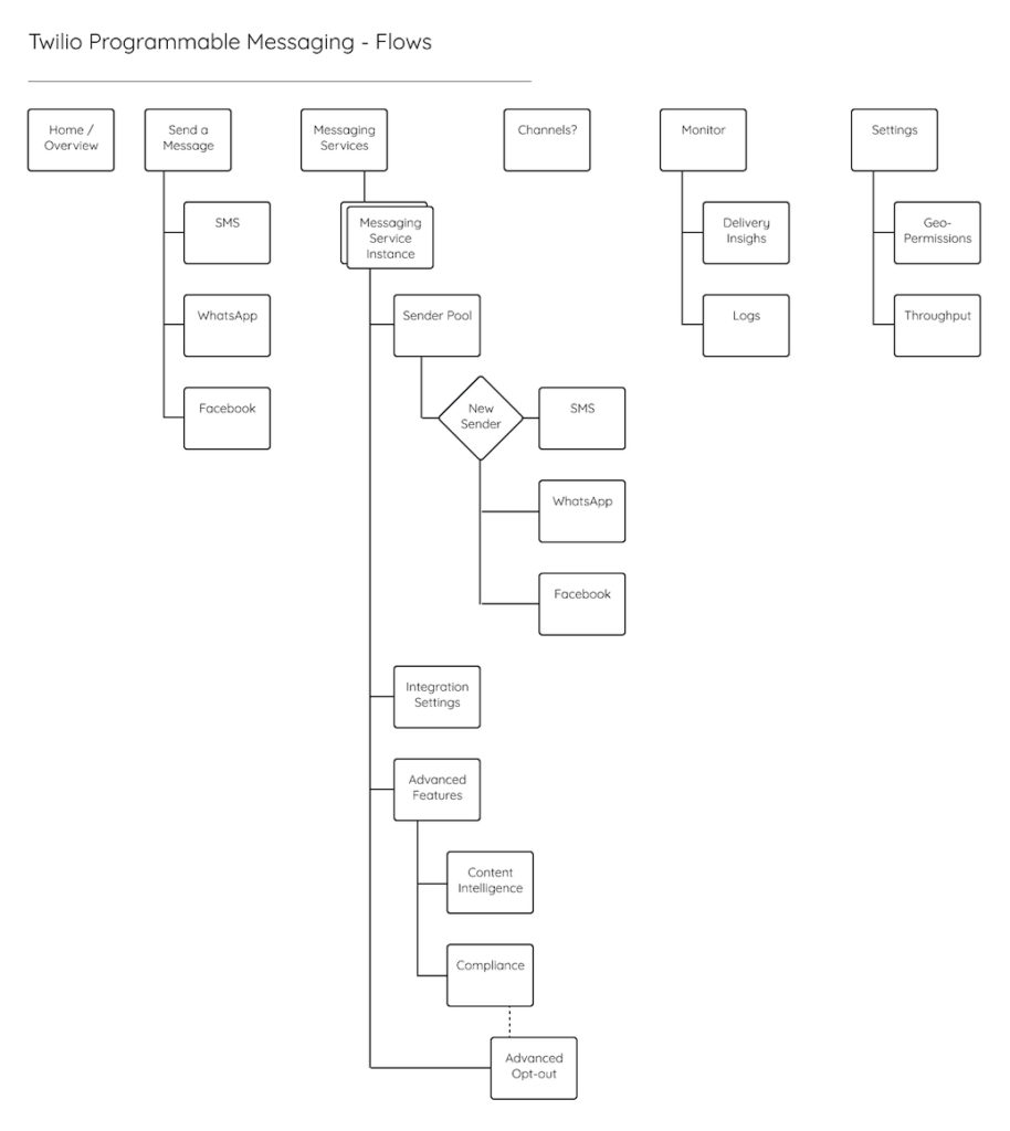
Based on the above testing, I developed a new Information Architecture for Messaging Console, one which also aligned more tightly with the actual Messaging APIs:
Exploration & User validation
Wireframing, prototyping
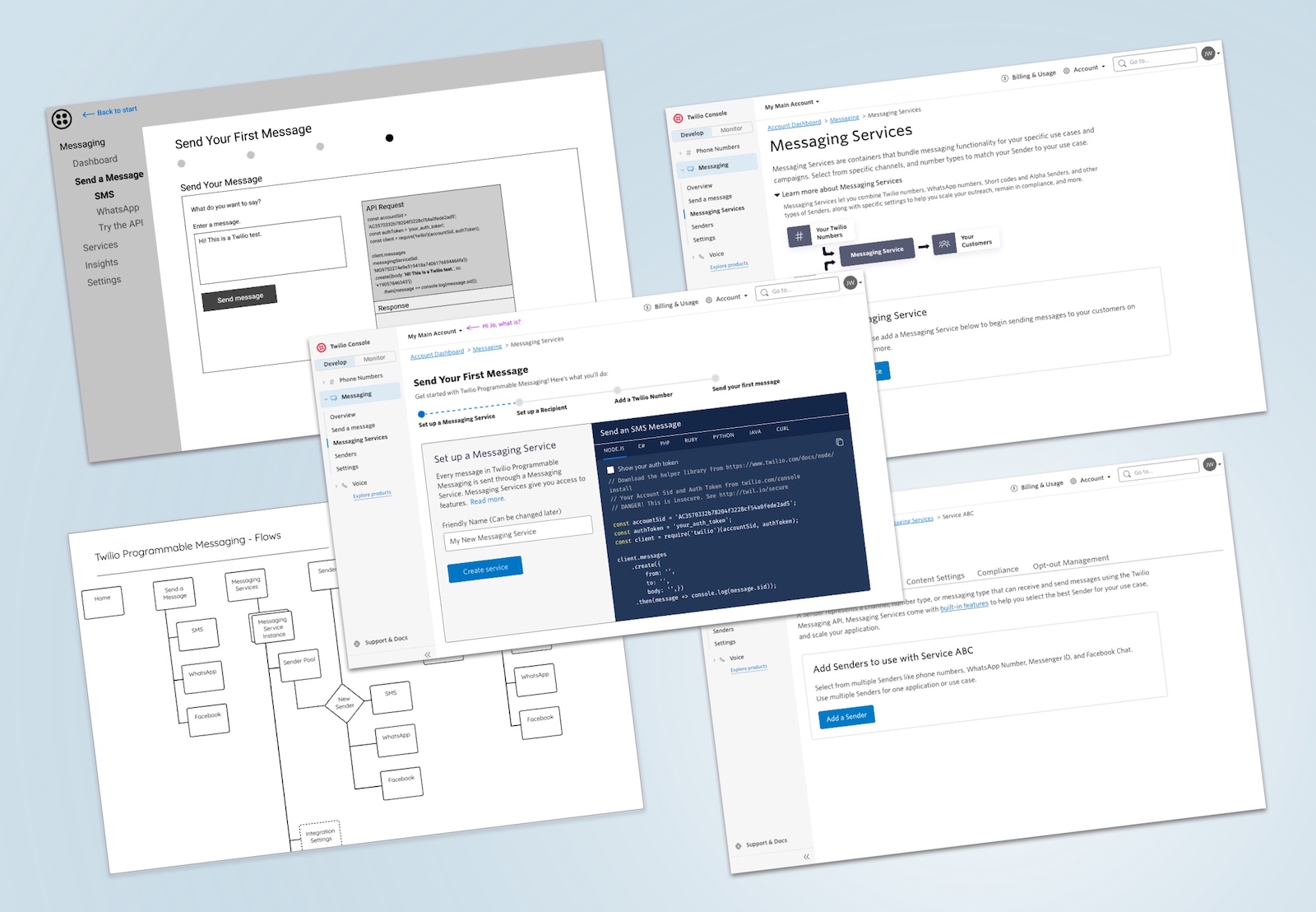
Armed with a new navigation structure we could be confident about, I began creating low-fidelity prototypes for testing.
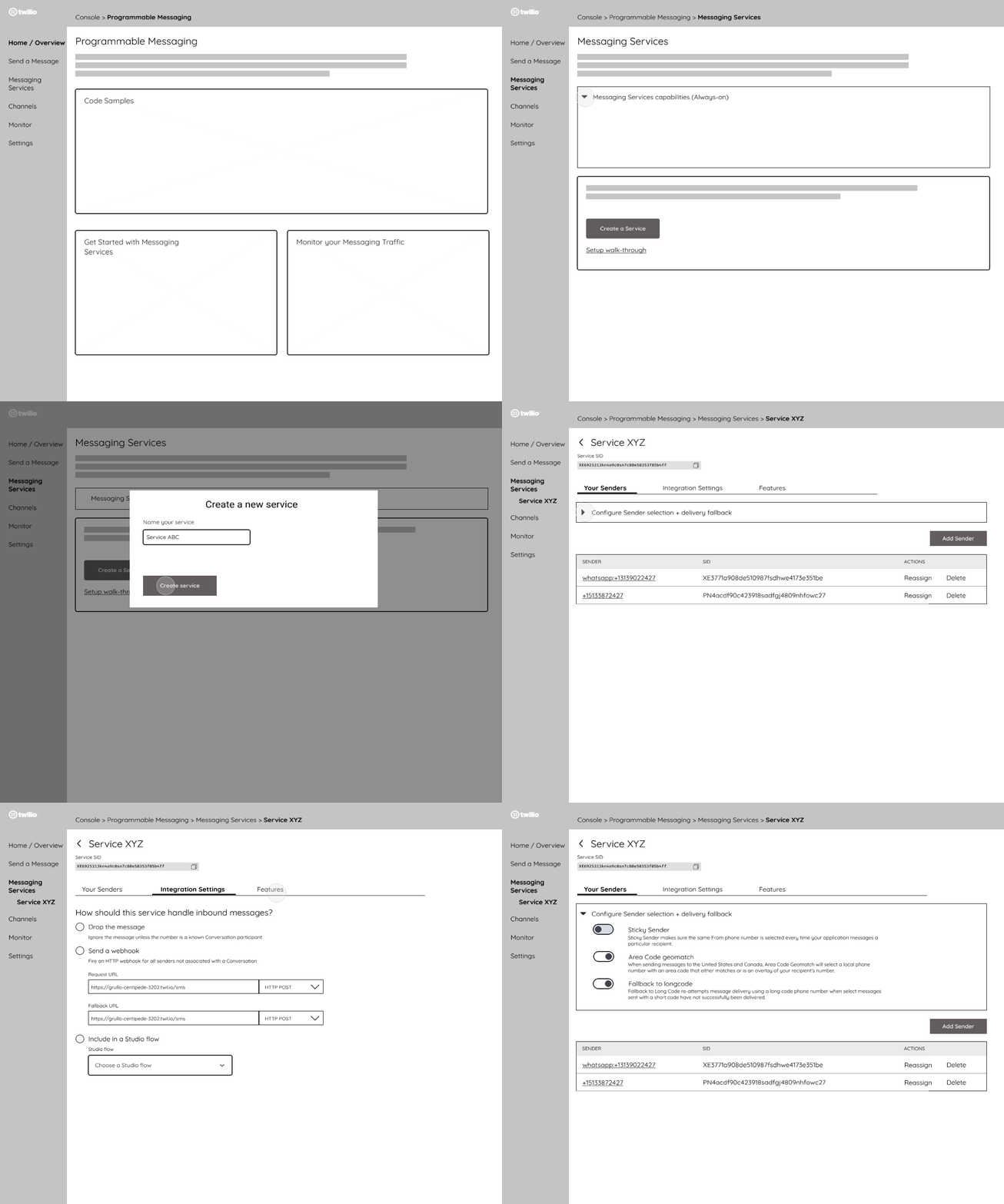
View this Figma prototype
Customer feedback
Learnings & iterations
Customers were navigating the prototype and finding Explore / tutorial tasks, but they were not finding essential production-related tasks to get up and running with the Messaging API. Nor were they intuitively locating some product features, when asked in usability testing.
We spoke with more developers and continued our card sorting exercises, geared toward uncovering their mental models around the actual tasks needed to integrate Twilio’s Messaging APIs with their applications.
Further iterations
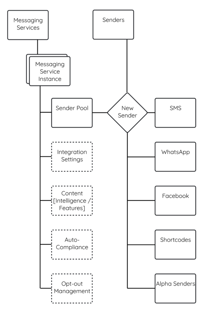
Refining the Information Architecture
The card-sorting exercises gave us valuable insight into how customers thought about API integration, customization, and configuration.
I re-architected part of the navigation to provide a more predictable structure.
Learnings & takeaways
✔ Generally customers understand Messaging Services after clicking around; most customers grasp that this is for using the API / sending messages in production.
✔ 11 out 12 of customers located all queried Settings-related questions (Compliance, Webhook URL, Click-tracking.
~ Sender Selection settings (e.g. Area-code matching) was inconclusive. Customers often found them by clicking around when they first land on the Senders page
👎 Adding-a-Sender flow was a failure – customers reported a common workflow: bulk-add Senders (Phone numbers), then add those to a Messaging Service. With our design, there was no way to bulk-add numbers.
Implementation, tradeoffs
Iterations / Decisions
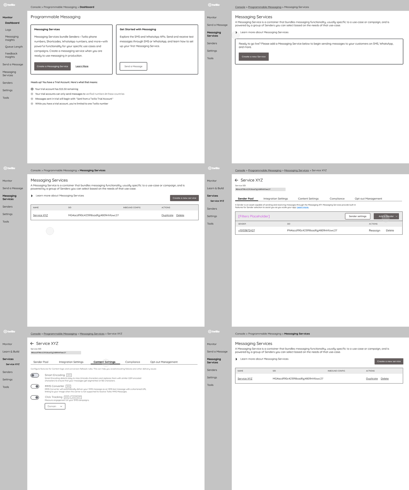
Based on the above, I moved to high-fidelity and began implementing the design using the design system and component library.
Design changes I made based on customer input:
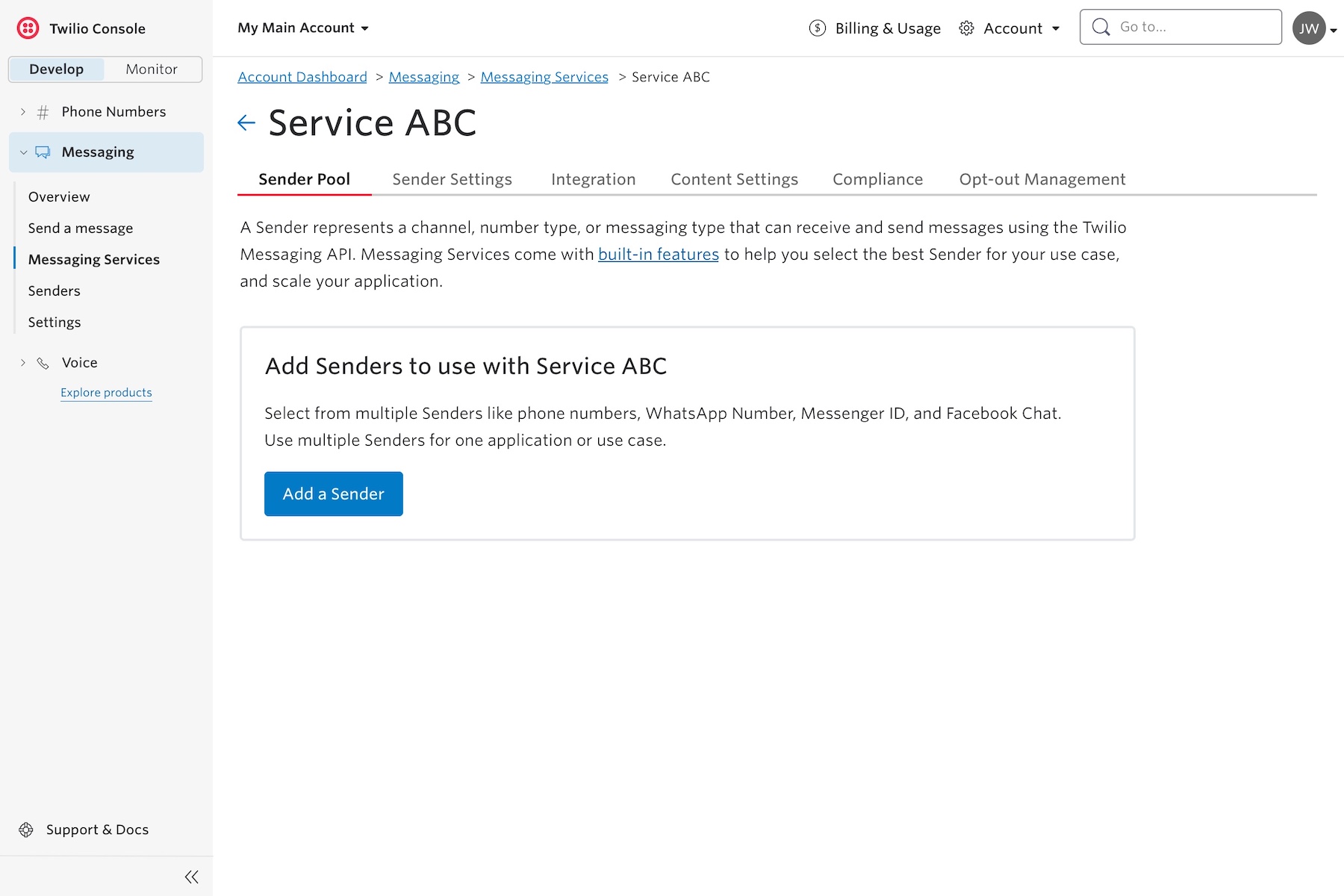
✔ I moved Sender Settings to its own tab. My product team really wanted to keep them with the Sender pool but customers were missing the Settings on every variant we tested.
✔ I did a deep dive on the Add a Sender flow, to explore how we could best bring needed functionality to the design.
High-fidelity work
