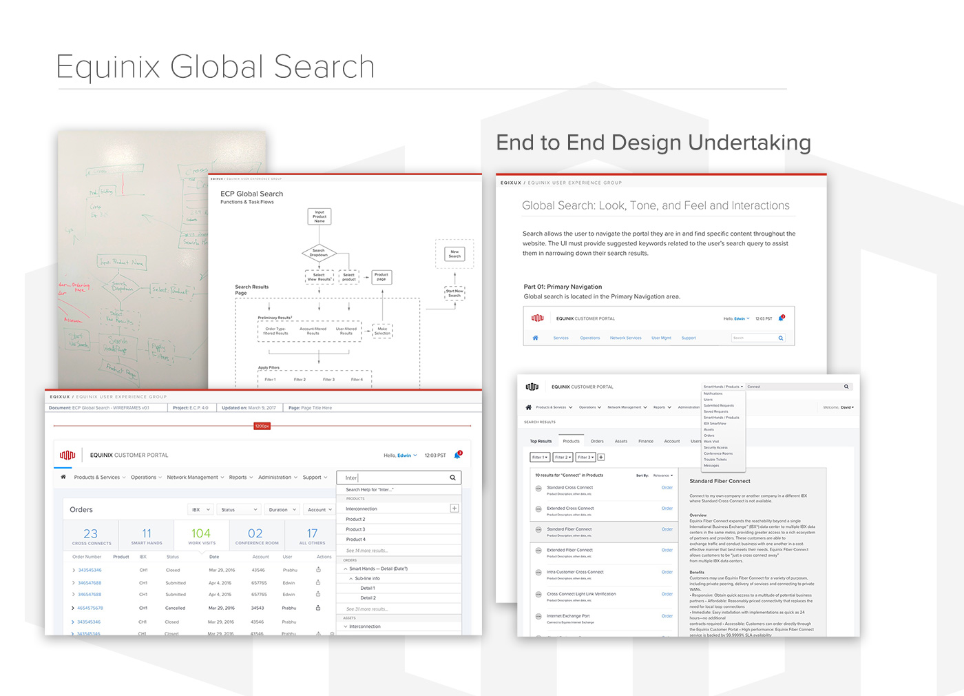
An end-to-end design study comprising research, interaction design, user journey mapping, and prototype development.
Problem:
Equinix, with its vast suite of product offerings, huge customer base, and myriad administrative and management functions, needed a complete overhaul of its entire search apparatus.
Solution:
A comprehensive analysis of the existing search functionality, and an extensive competitive analysis of other popular search implementations.
Then, a multi-day, cross-team design sprint to explore possibilities and establish a direction.
Finally, a broad, multi-sprint design effort to produce a robust set of proposals including task flows, wireframes, and mockups for Equinix Search.
My Role:
A lead design role on a small, focused product team building out the entire framework for the Search feature at Equinix.
Outcome:
A far-reaching and thorough proposal, and a click-through prototype (Invision) detailing numerous use cases and showcasing several proposed enhancements to discoverability, and an expansion of filtering and sorting capabilities.
Approach: Identify + Uncover
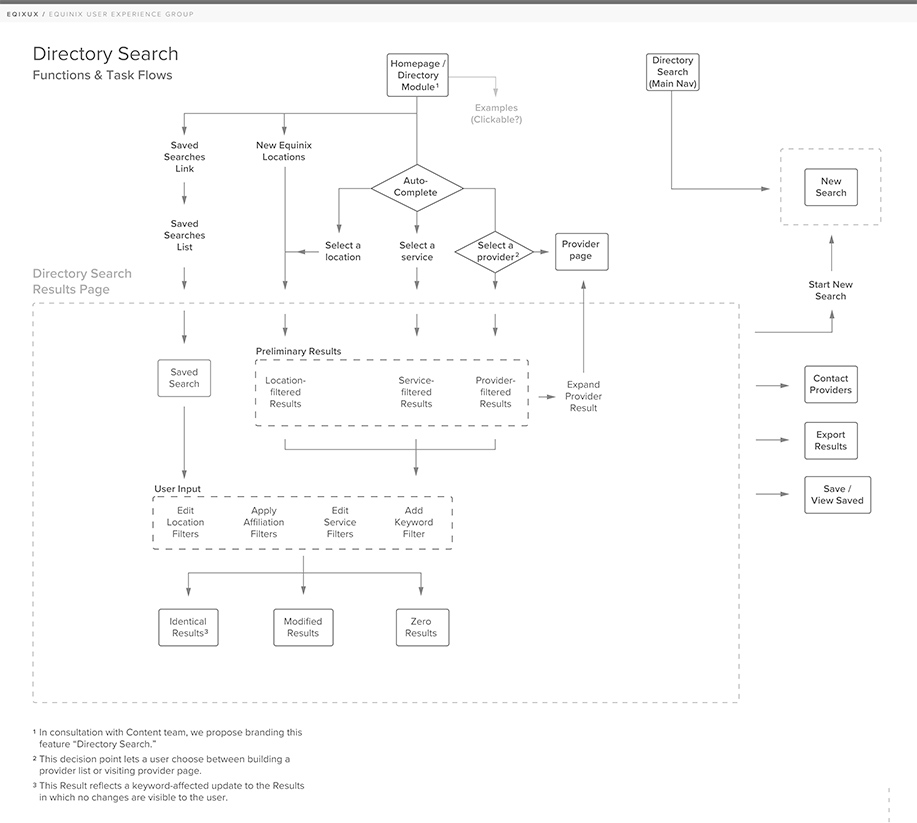
Identifying Critical Task Flows for Customers
After extensive and thorough review of user feedback and customer interviews, I sat with a Product Manager and an engineer to walk through a number of possible task flows for users coming to the Equinix Customer Portal. We used this time to identify areas where we felt there were tangible gaps between what users needed to accomplish, and how they went about doing so. Our emphasis was on discovering opportunities to improve the user experience, but also on recognizing our own biases and challenging our own assumptions.
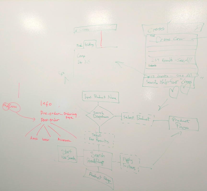
I sketched out a broad Information Architecture overview for the Product Manager and one of our developers.
Setting the Course: Uncovering Optimal Strategy
Even though the existing search capability contained many gaps and many, many flaws, it was critical to develop a broader strategy with which to approach Search across Equinix properties, rather than just start crossing items off a list. Leveraging user research into different user journeys involving Search-related tasks, we started sketching ideas, and began to uncover potential strategic directions.
After identifying strategic approach, it was time to circulate, and solicit feedback on our plan.
Architect + Iterate: Structure and Flow
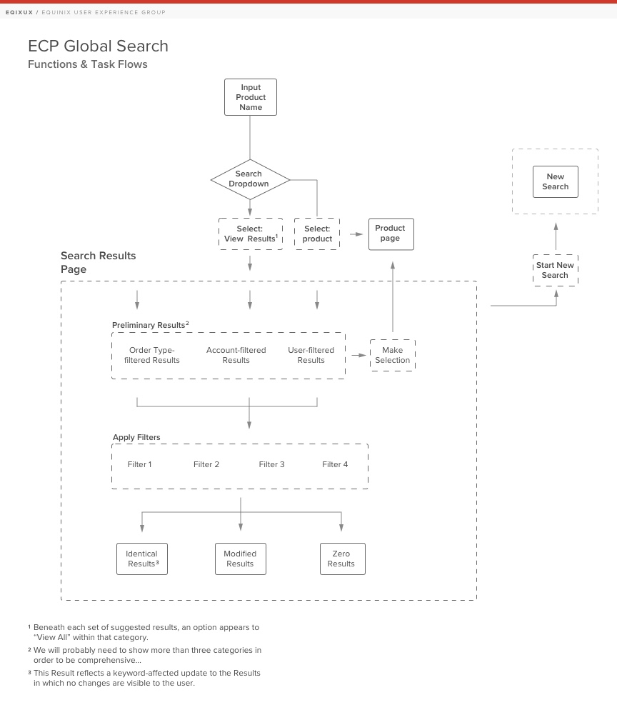
Working closely with key Product Managers and Product Owners, I further developed the central task flows that our customers would reasonably expect to complete when using our Portal. Emphasis was on discovering what users would expect to encounter when searching for a given content-type.
Explore, Create, and Share
Wireframe Explorations + Prototyping
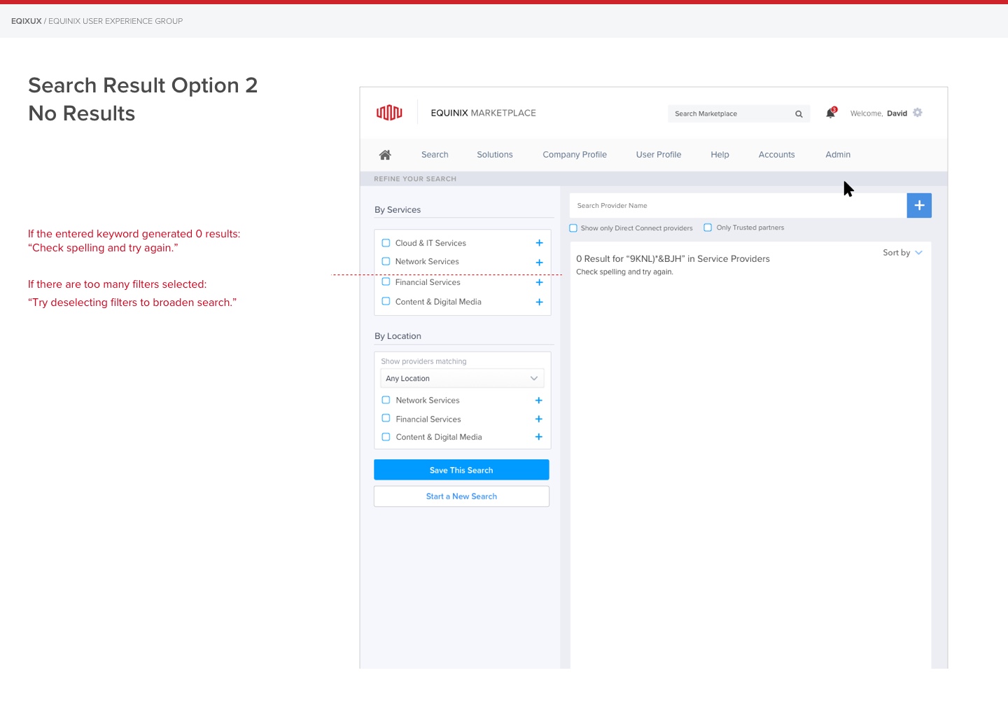
Armed with a broad understanding of the biggest usability issues facing our customers, I put several ideas into a shareable format – wireframes – so that I could gather feedback from my internal product and dev partners. I shared these thoughts with other designers and invited them into various design explorations as well.
Working through countless iterations,
creating, sharing, and calibrating based on the feedback we received, developing a variety of concepts and honing them with the product and engineering teams, allowed us to develop a number of different Search implementations that covered the vast majority of use cases we had before us.
Prototyping…
Using Invision App, I created a series of clickable prototypes to showcase the flow and interactions.
View Clickable Wireframe PrototypeLook, Tone, and Feel
Exploring Interactions
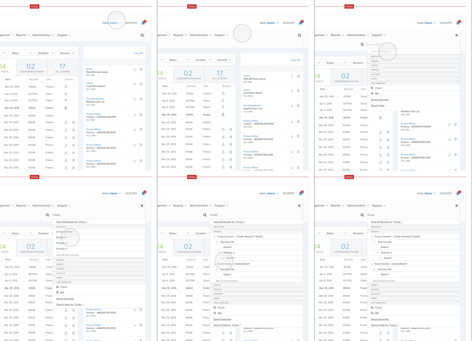
During this phase, I also did extensive exploration around how a preliminary Search component (i.e. Search Module on home page) might look and feel.

Using After Effects (these days I am using Principle for animation) I designed simple interaction models for delivery to developers.
These models offer a quick way to clarify expected behavior without relying solely on annotated wireframes.
Deep proficiency with creating simple animations allows me to quickly explore interaction models that may turn out to be sub-optimal, informing what we also choose not to pursue.
This design pattern illustrated a flaw in its design – pushing content down to expose the Search was recognized as potentialoy off-putting and disorienting for users.
Defining Aesthetics
What would a polished, high-fidelity Equinix Search experience look like? How would it align with existing design guidelines, and how would it innovate within those constraints?
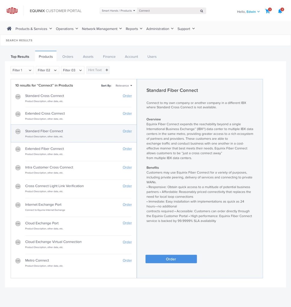
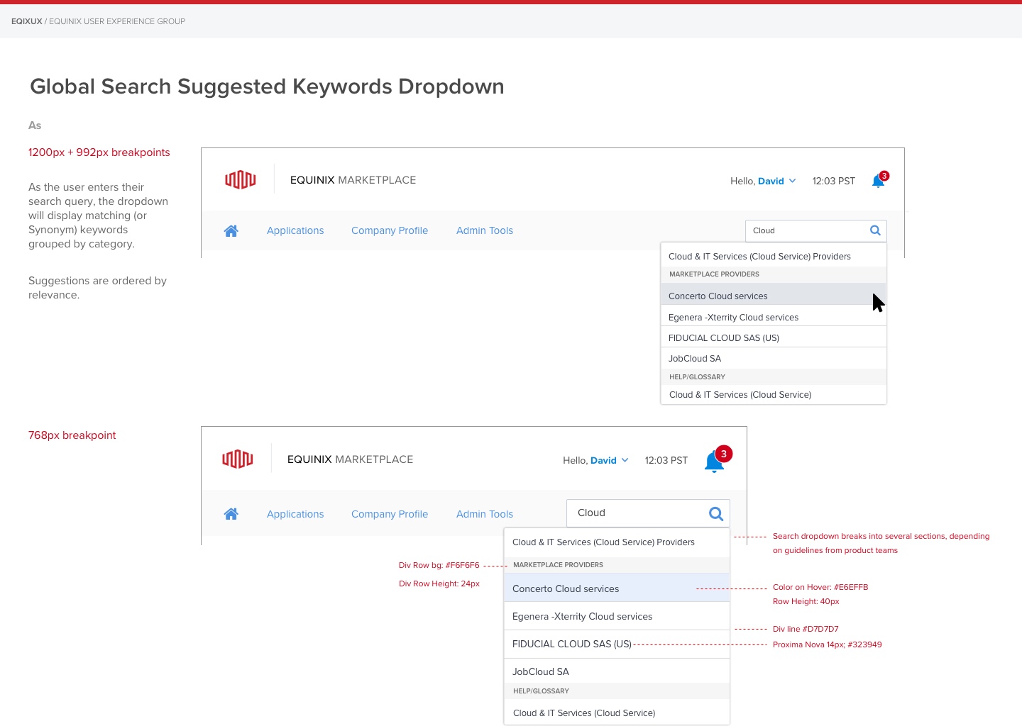
Designing Equinix Search Interface culminated in a series of proposals that included high-fidelity mockups that were aimed at capturing a cool, professional aesthetic and clean layout with ample white space.
Hand-off to Dev
Annotations, Specifications, Styling
Handing off work to developers is tricky, and requires great attention to detail, and thorough documentation around design decisions and directions, including styling and interaction guidelines.
Before any given sprint, it is crucial to provide thorough and detailed specifications around what needs to be built!

